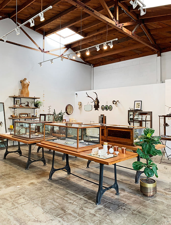
 Industrial gray, natural textures, and high-sparkle lighting: Here’s how the chicest jewelry retailers are adorning their stores
Despite all the attention being paid to e-commerce and social media, the look and feel of your brick-and-mortar store are still vital to your brand identity—and, when done well, a key driver of sales. If it’s been a while since your interior has seen a refresh (or even a coat of paint), maybe it’s time for a change. We’re not necessarily talking about a full renovation: Even a small-scale reboot can bring in current trends and make your store more inviting.
A Study in Contrasts
The industrial trend in residential and commercial design has not gone unnoticed by jewelry store owners. Likewise, the minimalist-boho vibe that rules Instagram style feeds (e.g., textured walls, woven textiles, live-edge furniture, and accents of Mongolian lamb) has trickled into the consciousness of style-forward jewelers. Embracing an industrial aesthetic characterized by metal and sharp lines while adding natural materials and organic shapes might seem like a contradiction, but cutting-edge retailers know the styles can coexist and even complement each other. Consider the following elements.
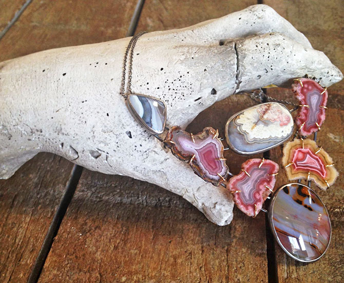
Industrial-inspired color palette: Store owners are using lots of gray hues that evoke—or actually are—weathered metal. “Our steel walls and concrete floors are a nod to industrialism,” says Laura Mapes, co-owner of Alchemy Jeweler in Portland, Ore. Citing her co-owner David Iler’s background in the steel industry, she adds, “where we’re located is formerly an industrial area, so we wanted to maintain that aesthetic.”
“One of our signature colors in our fonts and logo, our website, and our stores is a dark gray,” says Melissa Joy Manning, founder and designer of the eponymous jewelry brand. The silvery tone looks fresh among vintage wood shelves and cases in her Brooklyn, N.Y., and Berkeley, Calif., stores.
Steel also shows up as a popular material in custom-made display cases, which, in turn, has shifted the thinking about jewelry store–appropriate colors. Keith Kovar, principal at retail design firm GRID/3 International in New York City, says distressed metallic finishes are in high demand right now, as are deep blues and grays. Feature walls that add a dash of lighter or brighter colors remain popular, he adds, because they act as a visual “palate cleanser” to break up the deeper colors.
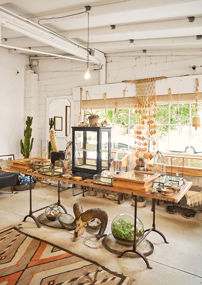
Natural textures: More and more store owners are dispensing with traditional velvet displays and utilizing organic materials in neutral hues to better showcase their merchandise. “A lot of independent [retailers] want to create their own image in terms of the props inside the cases,” Kovar says. “We’re seeing a much more natural approach. Everything from bits of plywood or chunks of glass to bits of metal—all kinds of background materials.”
Manning sourced deadstock suede that matches her signature color and lined her cases in rich gray; Mapes incorporated leather, linen, and wood to bring organic elements to her industrial space. Lauren Wolf, owner and designer at Esqueleto, with locations in Los Angeles and Oakland, Calif., displays jewelry on trays lined with beige linen. “The idea is the space being stark white, and bringing in that natural element to soften it a bit,” she says.
Cases that invite rather than intimidate: Some store owners think the typical counter-height case isn’t ideal because of the physical separation it creates between customers, staffers, and the jewelry itself. “A clunky display case doesn’t feel relevant or modern and may be intimidating,” says Wolf, who finds such cases suggest “an air of inaccessibility.”
Many design-forward owners are opting to commission customized display pieces. Cases that allow customers to get up close and personal with the jewelry—sometimes without having to ask an employee for access—include wall-mounted shelving (a bonus for owners who lack square footage) along with freestanding, 360-degree pieces positioned so browsers feel free to stroll all the way around. Not only does an unconventional display make for a friendlier vibe, but it’s smart merchandising, says Pam Danziger, founder and president of Unity Marketing in Stevens, Pa. “You can look at a necklace or earrings at about the same level as you would wear them.”
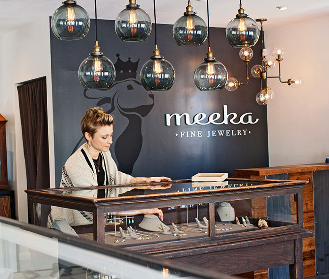
Lighting designed for interaction: As merchandise becomes more accessible, customers are more inclined to handle and try on pieces. However, says Wolf, “when you bring the jewelry out of that case, if you don’t have proper lighting, the jewelry looks quite different.” Adds Kovar, “What is changing is [the quality of] the lighting both in and above the case. Everything is going toward LEDs, and there are a lot more choices.”
When Monika Krol, owner and designer at Meeka Fine Jewelry in Camp Hill, Pa., moved her store to a just-renovated building, a top priority was making sure the pieces on display retained their sparkle and luster inside and outside the case. “In the previous store, each of the cases had light inside, so [the jewelry] looked beautiful,” she says, an effect that faded when the jewelry was removed and displayed under track lighting. Her solution: traditional recessed lighting, plus recessed lights pointing directly on top of cases.
Show and Tell
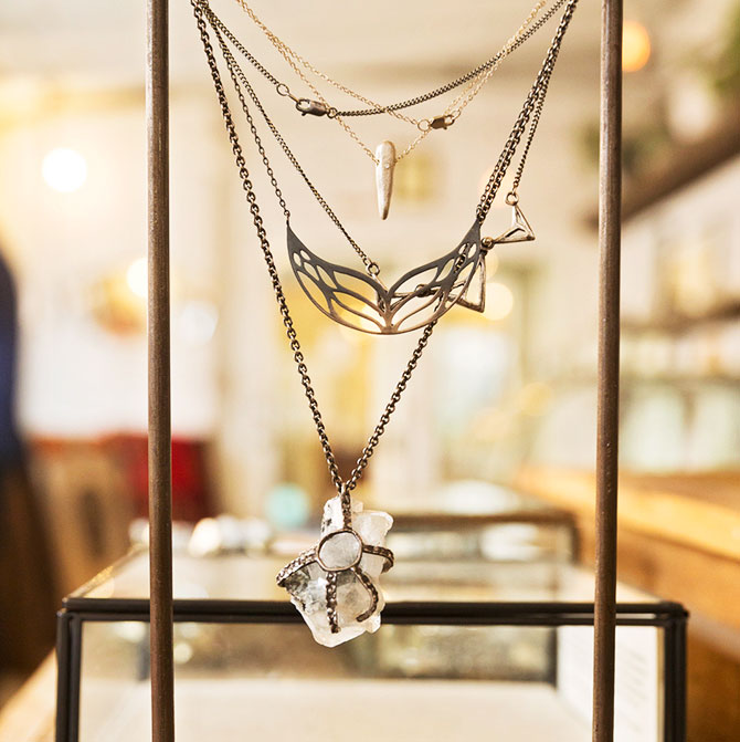
Just as one of the hottest restaurant trends is the Food Network–fueled concept of diners watching the chef prepare their meals, jewelry retailers say bringing the workbench or CAD design station out of a back room animates customer interactions. “We’re not just selling jewelry; we have that whole live experience, the open-kitchen aesthetic,” says Mapes.
“It can be valuable to let people see the magic behind the curtain,” observes Danziger. Plus: An engaged customer may spend more time in the store.
Alchemy offers not one but two spaces that show what’s behind the curtain, literally and figuratively. The store’s CAD specialist works adjacent to the front window with a computer monitor facing the street. “People can see jewelry being made in front of their eyes,” Mapes says. The interior bench workspace also is visible when customers are inside the store.
The Personal Touch
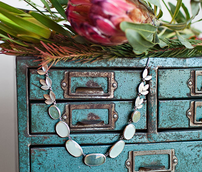
In an age of online shopping and rampant commoditization, store owners and merchandising experts say retailers need to deliver an experience, not just a product. The ability “to touch, feel, and interact with the merchandise directly relates to how much they’ll spend,” Danziger says of today’s shoppers.
Practically speaking, this translates into creating an atmosphere where customers feel content to browse and welcome to linger. “People say, ‘Oh my gosh, I want to live here,’ ” Wolf says of Esqueleto’s carefully curated space. “It’s an aesthetic they connect with outside of the jewelry.”
Manning wanted her stores “to feel like the customer was walking in to the jewelry, as opposed to just walking into a place to buy. I wanted them to feel like this is a cool space and to think, I want to spend time in here.”
Top: Melissa Joy Manning’s Berkeley store (photo: Dan Nakamura)