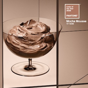
The Pantone Color Institute announced its Color of the Year for 2025: Mocha Mousse (17-1230), a “warming rich brown hue” that Pantone says suggests the “delectable quality of cacao, chocolate, and coffee.”
“There is a growing movement to align ourselves more closely with the natural world,” the Paramus, N.J.-based “color authority” said in a statement. “Characterized by its organic nature, Mocha Mousse honors and embraces the sustenance of our physical environment [and] finds harmony and balance between the demands of modernity and the timeless beauty of artful creation.”
JCK contributing editor Amy Elliott isn’t sure of any “immediate jewelry correlation beyond brown diamonds.” She says: “For jewelers, the opportunity that I see is that this color would be absolutely gorgeous as a new option for display and packaging. It feels rich, velvety, and warm.”
Jennifer Heebner, editor-in-chief of the American Gem Trade Association (AGTA) publication Prism, says she “loves” the choice.
“Mocha Mousse brings to mind visuals of brown zircons, natural-color Tahitian pearls, champagne and cognac diamonds, and smoky quartz—all warm, rich shades that mirror the decadent tones of chocolate,” says Heebner.
Katey Walker, owner of Katey Walker Fine Jewelry in Old Saybrook, Conn., calls the color “an elevated take on a modern neutral. I can see it intersecting with topaz jewelry, hessonite garnet, and even matrix opal.”
Mocha Mousse is significantly darker than past choices, like this year’s “gentle” Peach Fuzz or 2023’s “pulsating” Viva Magenta.
In a New York Times roundtable, style reporter Vanessa Friedman noted, “This is the first time in the 25-year history of Pantone’s Color of the Year that they’ve chosen a shade of brown, which is kind of a big deal.”
Elliott thinks the selection could presage “an overall movement away from stones in neon candy colors to those that are grayer, a little muddier. So instead of fuchsia pink, you get a pink that’s more of a rosewood.
“It’s very classic, very quiet luxury,” Elliott says of Mocha Mousse. “And I see a hint of a dusty pink undertone—in fact, I think we’ve seen this exact shade in blush and eye shadow.”
Times reporter Stella Bugbee said in the roundtable that the color “feels like such a repudiation of ‘brat’ green, which was a viral moment that no corporation could have predicted. So, in that way, it feels out of touch.”
But Pantone Color Institute vice president Laurie Pressman told NPR that choosing the Color of the Year is “us taking the temperature: What’s taking place in the world around us and how does that get expressed into the language of color? And as we were doing our research for this year, what we were really seeing more than anything is people looking for harmony and living a life of harmony.”
Friedman doesn’t necessarily agree the color corresponds to the current zeitgeist.
“This year has seemed to be about disharmony—a state that shows no sign of ending,” she said in the Times. “But then [Pantone] also said the goal was aspirational. And that mousse was a kind of foodstuff made for sharing.”
Additional reporting by Amy Elliott
(Image courtesy of Pantone Color Institute)
- Subscribe to the JCK News Daily
- Subscribe to the JCK Special Report
- Follow JCK on Instagram: @jckmagazine
- Follow JCK on X: @jckmagazine
- Follow JCK on Facebook: @jckmagazine


