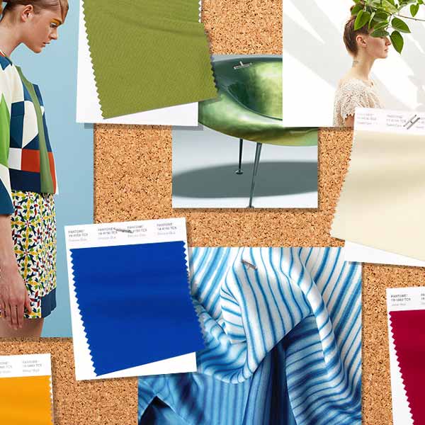
As New York Fashion Week kicks into high gear, Pantone has released its fashion color trend report for Spring/Summer 2019.
Featuring 12 colorful shades and four neutral tones, the report declares the mindset for Spring/Summer 2019 to “reflect our desire to face the future with empowering colors that provide confidence and spirit; colors that are uplifting; joyful hues that lend themselves to playful expression and take us down a path of creative and unexpected combinations,” according to Pantone.
Pantone describes the roundup of colors as choices that “transcend seasonality for both men’s and women’s fashion,” and, at a glance, that seems to be true. Hues like Jester Red, Terrarium Moss, and Toffee would be just as lovely and at home in autumn and winter, while Living Coral and Pink Peacock are as summery as they come.
Here is the full report:
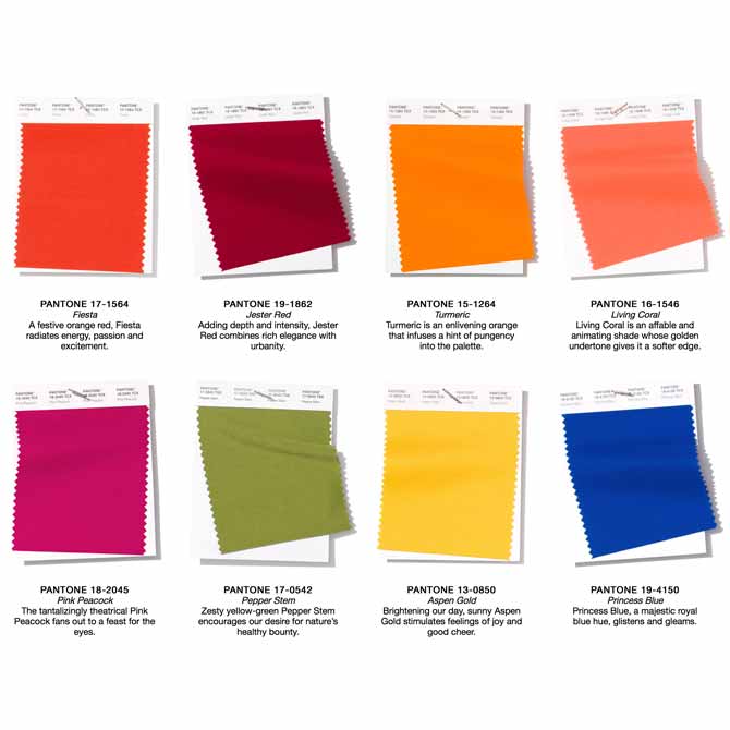
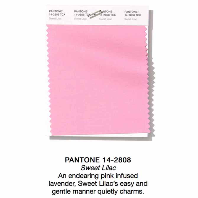
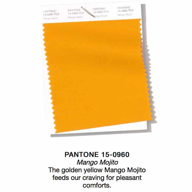
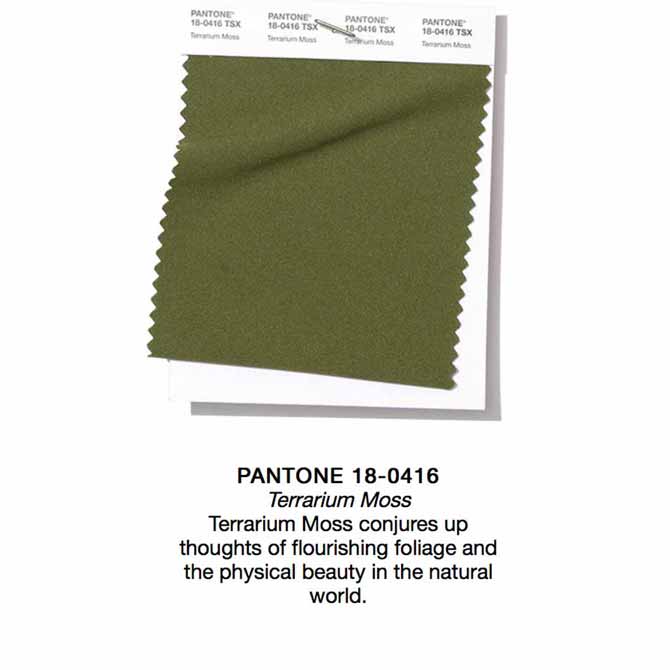
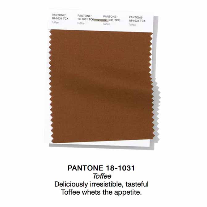
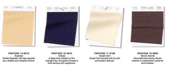
It’s not a surprise to see colors like Sweet Lilac, which recalls the Millennial Pink craze, and Princess Blue, an electric take on the mainstay color that promises to dominate the year ahead.
Turmeric, Pink Peacock, and Aspen Gold are all bright, cheerful colors that will prove exciting additions to any warm-weather wardrobe, and the quartet of neutrals in this recent report are beautiful and breezy.
There are some similarities to the 2018 Spring/Summer report, but the choices here are a bit more saturated, where 2018 had more of a pastel look about it. The 2019 selection is decidedly bolder, brighter, and, in this writer’s opinion, more fun. It will be very interesting to see which colors turn out to be crowd favorites, but at first glance, it looks as though 2019 may be a year for orange.
Keep your eyes on the runways, and stay tuned to JCK for more fashion week coverage and the best jewels to pair with Pantone’s new picks.
(All images courtesy of Pantone)
- Subscribe to the JCK News Daily
- Subscribe to the JCK Special Report
- Follow JCK on Instagram: @jckmagazine
- Follow JCK on X: @jckmagazine
- Follow JCK on Facebook: @jckmagazine