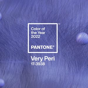
The Pantone Color Institute has named Very Peri (Pantone 17-3938) its Color of the Year for 2022.
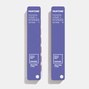
If you have never heard of “the warm and friendly” blue tone, that’s because it was just created. This marks the first time that Pantone has whipped up a new hue for its Color of the Year. It will now be added to the Pantone Fashion, Home + Interiors Color System, its widely used color standards system.
Pantone’s choice for Color of the Year has typically been influential in both fashion and jewelry circles.
“”Ideally this is a color you would want to see in a stone,” Laurie Pressman, vice president of the Pantone Color Institute, tells JCK via email. “Maybe there is a sapphire or tanzanite that could closest to this color. It is a color very well suited to enamel coatings which could be included into fine jewelry—i.e. butterflies or bird pins rings or bracelets or every patterning for earrings and neck.”
JCK contributing editor Amy Elliott believes that the new color is “perfect for tonal jewelry because it works with both blue and purple.
“We are nostalgic for the past right now when things feel so uncertain and turbulent,” she says. “Very Peri is the land of My Little Pony, stacks of color-ordered Benetton sweaters in the South Street Seaport store, and flipping through a J.Crew catalog circa 1993.”
She notes that Lady Gaga’s dress for the 2019 Golden Globes was a similar color—which some had difficulty nailing down—and may have spurred this new creation.
In a statement, the Carlstadt, N.J.–based “color authority” called Very Peri “a dynamic periwinkle blue hue with a vivifying violet red undertone,” which blends “the faithfulness and constancy of blue with the energy and excitement of red.”
The decision to create a new color, as opposed to choosing from its already broad palette, “reflects the global innovation and transformation taking place,” said Pressman in a statement. “The complexity of this new red violet–infused blue hue highlights the expansive possibilities that lie before us.”
She added the new color has a “spritely, joyous attitude and dynamic presence that encourages courageous creativity and imaginative expression.”

Last year, Pantone chose two colors—Ultimate Gray and a shade of yellow called Illuminating—as its Colors of the Year, to reflect both the tough times the world is going through and the hope for a brighter day.
(Photos courtesy of Pantone)
- Subscribe to the JCK News Daily
- Subscribe to the JCK Special Report
- Follow JCK on Instagram: @jckmagazine
- Follow JCK on X: @jckmagazine
- Follow JCK on Facebook: @jckmagazine


