There’s a hard fact to face: Many jewelry e-commerce sites are looking alike these days. Maybe not like carbon copies, but most definitely like very, very close friends. The kind who share clothes and a Netflix log-in.
Covering retail here at JCK, I look at a lot of e-commerce platforms. And it’s impossible to ignore the creeping visual homogeny, particularly in the direct-to-consumer jewelry category, which is (generally speaking) chasing a single market—millennials.
Why might this be a problem?
For starters, new e-commerce jewelry sites pop up every week. I’ve received notice of three in the past three days, and it’s only the first week of the year. The environment is cutthroat competitive, and becoming more so.
This makes presentation a crucial point of differentiation. If a website is built to visually echo one that felt pioneering a few years ago (such as the much-copied Into the Gloss) and has been aped mercilessly since, it may have a tough time standing out in the crowd.
Also, jewelry is both a high-ticket item and a deeply personal purchase. Consumers want personality in their jewelry, and in the entities they buy it from. You potentially do your inventory a disservice when you strip every shred of personality from the platform it’s presented on. When everyone’s selling off a stark white site, how are you, as a jewelry creator/curator, different from the retailer four clicks away?
How did it come to pass that websites look so similar? I have a few thoughts.
The Big Cleanup
A decade ago, the phrase clean design entered the lexicon of every retailer. With it came a mandate: Your site had to be super-duper-streak-free “clean”—meaning, it had to shed every nonfunctional element and adopt a stark white background. Borders on photos? Sacrilege.
So now, years down the line, clean is a word every e-comm platform, website developer, and graphic designer lives and works by. And I’m not knocking it! Of course you want a clean-looking site when you’re selling things—one that’s free of distraction and fussiness. But somewhere along the line, clean turned into “sterile” and even “fun-free.” Chic illustration, cool little design flourishes—they’re scarce. Most sites are slaves to the monk-like austerity pioneered by Instagram. But an e-comm site doesn’t need to look like an Instagram grid. And, in fact, it probably shouldn’t.
Thinking Pink

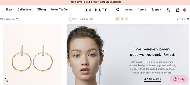
The light pink-and-white palette pioneered by AUrate, Glossier, and other seminal millennial-focused e-comms, has been copied by countless fashion and jewelry e-tailers.
The craze for millennial pink—a light-but-bright pink that sometimes feels like it coats the entire universe, it’s so ubiquitous—shows no signs of abating. But it’s been around so long (it appeared like magic in 2012), it’s looking and feeling stale.
But for web designers and certain jewelry and fashion brands, it must feel like a safe color choice. Because it’s still literally everywhere. Remember the two new e-comms I told you about that debuted this week? They’re white and pink.
Instagram is amazing. I love it and post to it almost daily—both to @jckmagazine and on my three personal feeds (over the top, I know). If you use it, you probably love it, too. Its design is incredibly clean, and when the social network debuted, its wholly unfettered look felt very fresh.
But now it’s beginning to feel like e-comm developers have taken Instagram’s visuals as rule and law. That’s left several jewelry websites devoid of any and all visual zing.
Listen, I’m not a proponent of web design that interferes with a speedy and friction-free shopping experience. But in the future, I’m hoping jewelry brands (especially young and nimble ones) will let go of the fear and make their digital storefronts as interesting—and even experimental—as their carefully curated inventory.
(Top photo: Pexels)
Follow me on Instagram: @emilivesilind
- Subscribe to the JCK News Daily
- Subscribe to the JCK Special Report
- Follow JCK on Instagram: @jckmagazine
- Follow JCK on X: @jckmagazine
- Follow JCK on Facebook: @jckmagazine