Color-forecast season is in full swing. Last week, JCK’s On Your Market blogger, Brittany Siminitz, wrote about Pantone’s Spring/Summer 2019 fashion color trend report. The week before that, she covered the 2019 Color of the Year announcement from Behr, a California-based supplier of architectural paints, while I weighed in on the fall’s most promising jewelry trends (as well as a hint of colors to come).
And now I’m about to confuse you even more by divulging yet another set of predictions about the hues, tones, and shades that will help guide designers, manufactures, retailers, and consumers of fine jewelry in 2020.
My intel comes from the London-based trend forecasters at mega-agency WGSN, who teamed up last week with the 1-year-old color consultancy Coloro to discuss the five key colors for spring/summer 2020. Emma Allwood, head of fashion at Dazed, moderated the webinar.
Jane Boddy, head of color at WGSN (what a title!), and Joanne Thomas, content editor at Coloro, provided some fascinating insights into the colors coming down the pike in a year and a half. Here’s what you need to know from their conversation:
Color forecasting is a sciency art
“Here at WGSN, we don’t just pick out five key colors,” Boddy said. “We work with what’s happening with color in general. We pull in about 40 colors. We’re working with global markets and looking globally at where color is going. Each season, we like to pinpoint the tones we feel are going to make the biggest impact globally. Some might be known, but have evolved. Some colors come and go in six months, others last up to five years.”
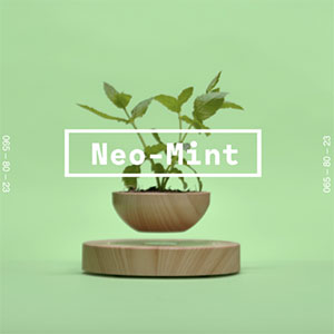
Neo-Mint may sound like an ice cream flavor, but…
According to Boddy, it’s “our most progressive color. It’s a new color for us. We look very much ahead. What is happening in 2020? It sounds very space age, doesn’t it? We have the Olympics starting in Tokyo, the first AI Olympics, with robots judging gymnastics. The world’s tallest tower will be built—neo-futurism as a style of architecture. So this color embodies futurism. At the same time, we’re looking at the planet—at plant life and algae and ways to protect what we have. So the futuristic tone has a hint of green in it.”
The trending colors are all about optimism
“Our second color, Purist Blue, has a similar feeling [to Neo-Mint],” Boddy said. “It’s futuristic, very clean, very refreshing. It’s a very core tone, very sellable. These commercial blues are becoming super fashionable.”
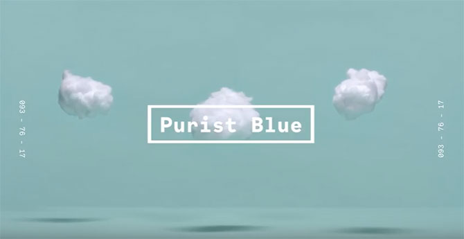
“Blue has always been voted the world’s favorite color,” Thomas said. “It’s the color of the sky and the sea. It’s meant to both ground you and lift you. People tap a lot into it in branding. Banks use blue because it connotes safety and stability. Also, when you’re color-blind, blue is the easiest color to see. But this shade of Purist Blue is an optimistic tone, quite uplifting.”
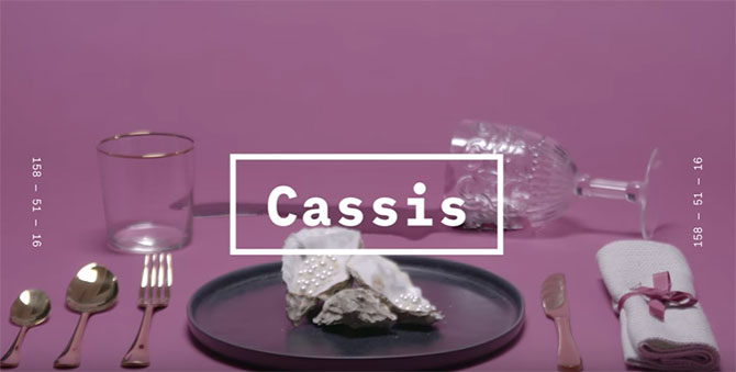
“Color is very optimistic, and that’s where color sits at the moment,” Boddy said. “Our third shade, Cassis, represents how we look back. We had millennial pink, purple, and lilac tones—these three have been very big talking points. Purple and lilac are huge on social media. Those trends will continue and grow. With Cassis, we looked at those colors and we’re seeing where it’s going to go. It’s very gender neutral as well.”
Get ready for “Gen Z yellow”?
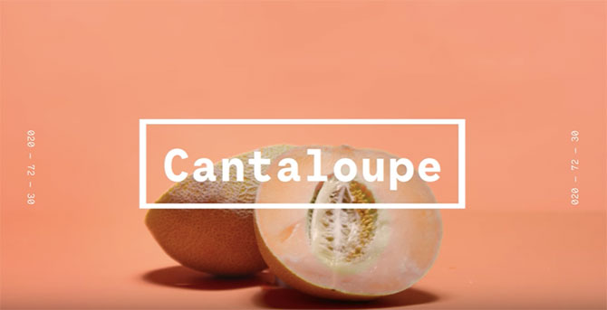
“Color no. 4, another color that takes its name from a fruit, is Cantaloupe,” Boddy said. “It’s very playful, juicy. The way we came to choose it: We were looking at the huge trend in yellow and orange, and also at the impact of millennial pink, and put them together to get these dusted- down tones.”
“The fifth tone is Mellow Yellow,” she adds. “Yellow is a hot topic at the moment. We’ve been talking about it for about three years at WGSN. It’s a very controversial color. Some people say they’d never wear it. It’s huge in China. We’re seeing it dusting down a bit, becoming a lot more golden.”
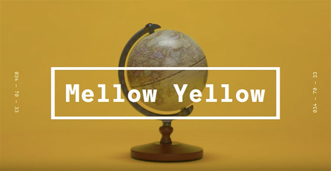
“For so long, people avoided yellow because it’s so easy to get it wrong,” Thomas said. “It strays between discomfort and familiarity.”
“Now people are saying Gen Z yellow is the new millennial pink,” Allwood said.
“I don’t like the idea of assigning a color to an age group, because I think color trends are for everyone,” Boddy said. “You can be 90 and wear Gen Z yellow, but maybe it’s been called Gen Z yellow because of Snapchat. Yellow embodies a youthful vitality.”
“After millennial pink, they were looking for the next color,” Thomas said. “We’re seeing yellow bubbling up. Also, a lot of influencers are popping up wearing it. It’s not just one shade. You see different nuances of the shade with the same mood: youthful.”
The color mafia they are not
“We have a very big team internationally: São Paulo, Australia, New York,” Boddy said. “We gather together on Trends Day. We share what’s happening economically, in the art world, in the music scene—all these things impact how trends work. Second, we review how color will continue its journey. Has yellow had its moment? We’re also looking at data and seeing what’s happening in retail. We can see the swing toward brights going up. We follow this journey of color—in the ’90s, it was all about neutrals and navies, to now, when it’s all about brights. It’s about seeing patterns.”
“But can it be a chicken before egg situation?” Allwood said.
“People can say if we’re saying a color is going to be popular, they’ll jump on it,” Boddy said. “But actually, if we’re following this journey, we’re going down the same journey that culture is going down.”
Top: Introducing Neo-Mint, the key color for S/S 2020, according to WGSN (all photos courtesy of WGSN)
- Subscribe to the JCK News Daily
- Subscribe to the JCK Special Report
- Follow JCK on Instagram: @jckmagazine
- Follow JCK on X: @jckmagazine
- Follow JCK on Facebook: @jckmagazine