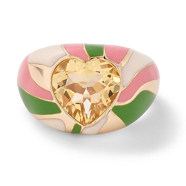
Technically, as mom to a newborn who arrived in early September, Alison Chemla Chetrit, founder and designer of the New York–based line Alison Lou, is understandably probably feeling a little tired, a little overwhelmed, and all the other emotions first-time moms experience in the early days of entering what the One Bad Mother podcast calls the “newborn forest.”
The vibe of her latest collection, Groovy, however, has quite the opposite effect, so we can just let her rest and inhale what she’s putting forth here: a gazillion jewels across every category that collectively immerse you in that 1971 Coke commercial, with stops in London, a Grateful Dead concert beneath the stars, and perhaps even the mean streets of New York—all during the same time period.
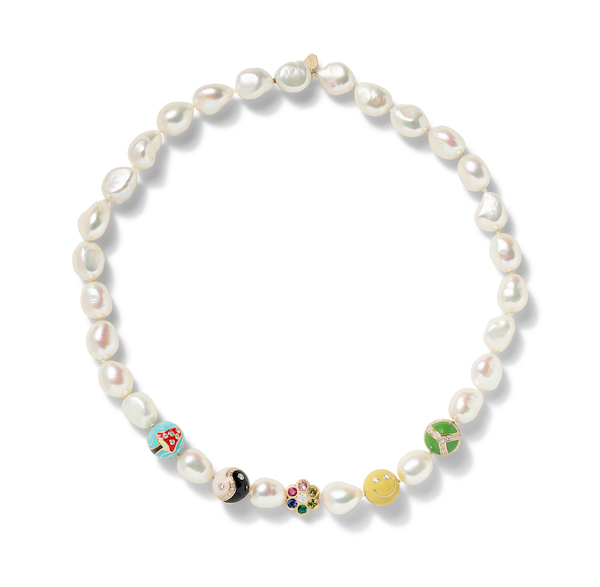
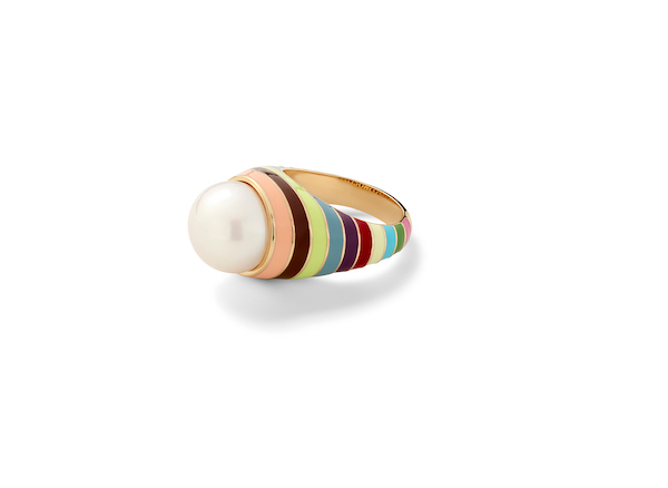
“The ’70s were a time of celebrating individuality and questioning traditional authority, and with the rise of disco and a new creative outlook on fashion, there was so much to be inspired by for this Groovy collection,” Chetrit tells JCK. “I have always loved to create jewelry that incorporates bright colors, using enamel and funky, unique designs, and it was also the perfect collection for me to introduce new techniques and materials that we have not done before, such as pearls, opals, and hand-painted tie-dye enamel.”
About that tie-dye enamel: “I knew that I wanted to incorporate [a tie-dye effect] into the collection. It took a lot of trial and error to make the tie-dye perfect. All of my fine jewelry is made in New York, and I am able to work directly with my enamel specialists to oversee the entire process. Each piece is hand-painted and is essentially a mini piece of art. No two pieces are exactly alike!”
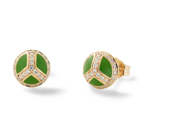
You will note rather obvious nods to the classic Wes Wilson concert posters of the late 1960s and early 1970s, and, in addition to tie-dye, the era’s most familiar motifs (peace signs, flower crowns, Alice in Wonderland mushrooms) are well-represented. For Chetrit, the concept of Groovy is broad and wildly tendriled, so I think it helps that there are some clearly stated “heroes” to ground and solidify the idea. A designer can’t just jump on the hippie van and never look back to see if we’re along for the (magic carpet) ride.
I also spy elements of the Biba aesthetic; the London department store was an icon of the Swinging Sixties, famous for a kind of bohemian-meets–art deco vibe—very Twiggy—filtered through the lens of the era’s glamorous hedonism (see: Bohemian Rhapsody (2018); listen: “Killer Queen”).
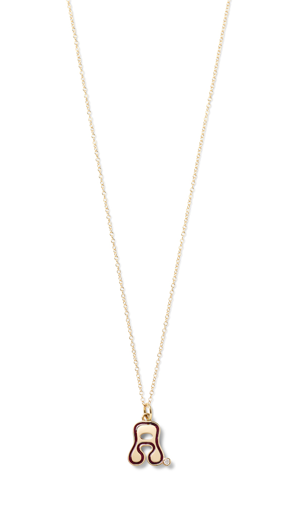
The font Chetrit chose for the alphabet pieces in the Groovy collection was a considered choice—Biba-ish with whispers of the Bradlees logo, which is kind of perfect: “I had previously drawn a bubble-letter font a while back that I wanted to incorporate but it did not feel very ’70s. Then, while creating my mood board for this collection, I saw this cool, drippy font and I knew I could somehow combine aspects from that with my bubble letters. The alphabet is always hard because some letters need more tweaking than others, but I am truly in love with this font. The Stellar Letter pieces are some of my favorites in the collection.”
Mine, too. See these—and more far-out favorites—below.
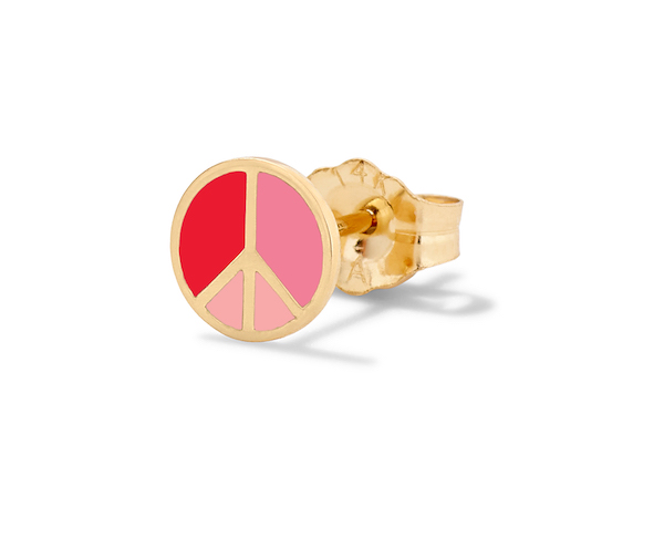
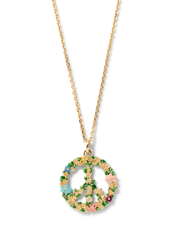
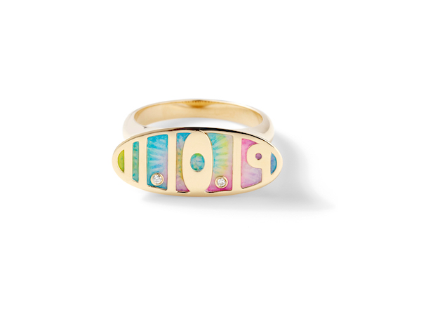
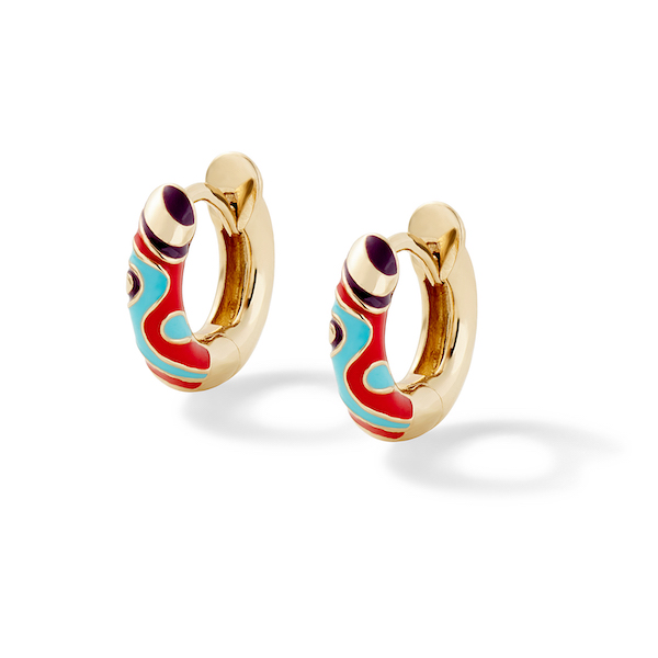
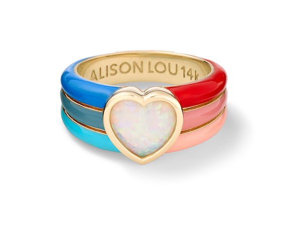
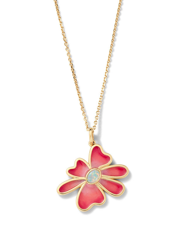
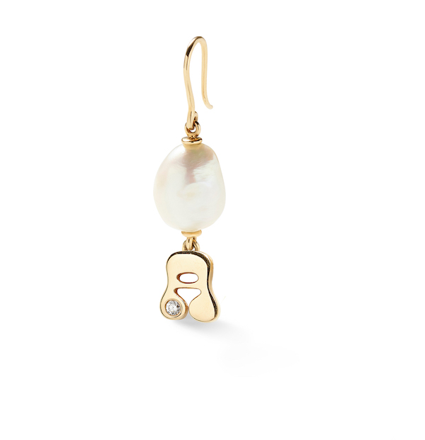
Top: Trippiest yellow cocktail ring in 14k yellow gold, enamel, and lab-created yellow citrine, $2,575; Alison Lou
- Subscribe to the JCK News Daily
- Subscribe to the JCK Special Report
- Follow JCK on Instagram: @jckmagazine
- Follow JCK on X: @jckmagazine
- Follow JCK on Facebook: @jckmagazine


