The holidays, they are upon us. Crazy, right? You may have just finished up your summer vacations, jumping from swimsuits to sleigh bells at the speed of light. But retailers have been planning for this busy time of year at least since JCK Las Vegas, those plans coming to fruition in the form of new stock for their stores.
As crucial as getting the right product in-store is, it won’t amount to much without the proper ways to market it. You may be thinking of ramping up your social media advertising budget this year, or maybe you’re putting together an elegant holiday soiree that will give your customers the ultimate in-store experience. Yes and hell yes to both of those things—just don’t forget about your email marketing.
Instagram may be working on streamlining shopping directly via its app, and it’s doing a great job of making customers say, “Take my money!” at the push of a single button. But, personally, I find no method more effective for making sales than the email.
Sure, the “swipe up to buy” shtick on Instagram has tempted me from time to time, but I think I’ve purchased something while scrolling through my feed only once so far this year. But emails? That’s another story altogether. Send me a coupon code for 15% off? You just made yourself a sale. New, limited edition items in stock? Gimme. Taking preorders for that super hard-to-find holiday treasure that’s bound to sell out? Put me on that list. And with emails, when you can click through on your phone and get exactly what you need, it’s easy (it’s easy with Instagram, too, but somehow I just find emails more convenient).
To reach a majority of your customer base, a combination of Instagram and website sales (as well as in-store, no doubt) is the sweet spot to aim for this holiday season. Don’t sleep on either.
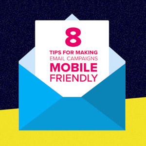
To give you some inspiration on how to formulate the best, most compelling customer newsletters this year, I thought I’d share this infographic I found from CleverTap, a mobile marketing platform, on how to create mobile-friendly email campaigns.
I mentioned that I often click through emails to make purchases? Well, if the websites aren’t formatted for mobile, forget it—I’m out. And it looks like many agree: According to a statistic shared by CleverTap, 80% of subscribers say they delete an email if it doesn’t render well on mobile, and 30% will unsubscribe completely if just a single email isn’t optimized for their mobile device. Ouch—not a forgiving crowd.
A quick summary of the infographic’s most important points:
•Keep subject lines brief but effective.
•Don’t forget the pre-header text (a summary of your email that can be seen under the subject line on mobile devices).
•Personalized emails—suggesting products based on past purchases, including the recipient’s name, etc.—have a higher transaction rate.
•One single, clear call to action, padded with plenty of space and placed near the top of the email is said to increase clicks.
•Bite-size bits of content tend to work best—bulleted lists, short paragraphs—with a larger font for easy reading.
Below is the infographic if you’d like to see what this particular company suggests, but I think the bottom line is: Keep it simple. Do whatever you can to produce the least clutter in your emails, make it easy for them to click through to your website, and steer clear of frustrating roadblocks (like broken links, unlinked call-to-action buttons, and too-small text). I think it helps to sweeten the deal with an advertised sale, promotional code, or just some of the most incredibly compelling jewelry photos you have available, to encourage click-throughs. But whatever you do, just make sure you take the time to give your email clients some love this holiday season—they may return the favor.

- Subscribe to the JCK News Daily
- Subscribe to the JCK Special Report
- Follow JCK on Instagram: @jckmagazine
- Follow JCK on X: @jckmagazine
- Follow JCK on Facebook: @jckmagazine